


The new James Bond movie uses the same font as The Love Boat
Bond, exciting and new…

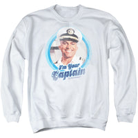
The name's Stubing, Merrill Stubing. You may laugh, but James Bond and the Captain of The Love Boat have some things in common. Bond was a Commander in the Royal Naval Reserve. Captain Stubing wore epaulets aboard a big boat!
The two franchises also shared a love for beautiful actresses. "Bond girls" Jill St. John (Diamonds Are Forever), Britt Ekland (The Man with the Golden Gun) and Tanya Roberts (A View to a Kill) all appeared aboard The Love Boat. And let's face it, James Bond often fell in love aboard ships. (Somehow, no James Bond actor himself guest-starred on the TV series. Not even Pierce Brosnan.)

Now, James Bond and The Love Boat share something else in common — Futura Black.
The logo for the upcoming 2020 James Bond film No Time to Die uses that iconic stencil font, as did The Love Boat. You can see it on the poster and in the teaser for No Time to Die. Those distinctive triangles in the capital "E" really give it away.
To be fair, The Love Boat was not the first or only property to use the font. The font dates all the way back to 1929. The Minnesota Vikings used Futura Black from 1982 to 2003.
Still, when we see Daniel Craig in that new poster, we can't help but sing, "Love, exciting and new! Come aboard! We're expecting you!"


Related


4 Comments


But the font is used extensively in film & video. Known for its ability to be read quickly from a distance!! And (not accidentally) gives the Bond 25 "No Time to Die" tile even more impact! 😉
However the use of this modern font for the "Love Boat" title was an interesting counterpoint to an otherwise schmaltzy TV series premise 😉